Products

BizDash is a service offering fast creation of drug and clinical trial landscapes -- including powerful visualizations like pipeline bullseyes -- integrating data from key pipeline and trial databases.
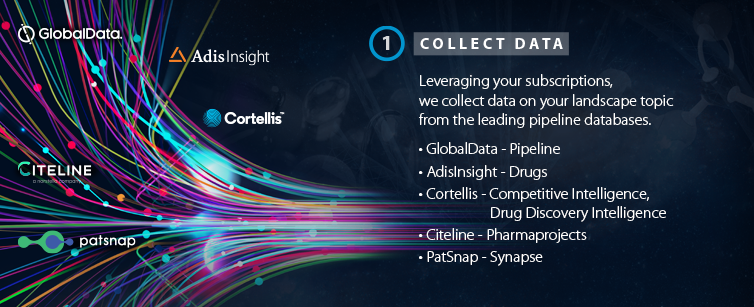
Using industry-leading BizInt Smart Charts, Smart Data Integrator, and VantagePoint analytics algorithms, we leverage your valuable subscriptions for leading data sources including Adis, Citeline, Cortellis, GlobalData, and PatSnap to construct targeted visualizations and reports in PowerPoint, Excel and Word.
Frequently Asked Questions (FAQ), including timing, pricing, etc.
eBrochure (PDF)
How does BizDash work?
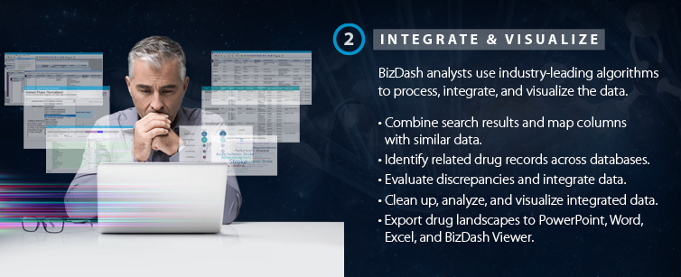
The BizInt team works with you to understand your needs, execute the right search strategy (using your data subscriptions) and then create tailored reports and/or visualizations.
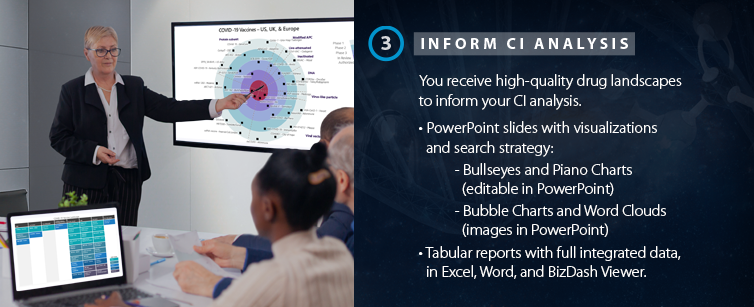
Below are examples of PowerPoint slides included in BizDash Drug Landscapes, including Bullseyes, Piano Chart, and Bubble Chart.
Sample Landscape: COVID-19 Vaccines


Pipeline Bullseye
[Visualization 1/4]
Our VP-SCE Bullseye is a compact way to show development progress of a number of projects divided into groups. This bullseye presents COVID-19 vaccines in clinical trials in the US, Europe and UK (as of June 2021) grouped by vaccine technology. Vaccines are plotted by the highest phase in the US, UK or Europe.
Sources: Citeline Pharmaprojects, Adis R&D Insight, Cortellis
Bullseye
[Visualization 2/4]
This bullseye presents "Rest of World" COVID-19 vaccines (as of June 2021) which are not in clinical trials in the US, Europe and UK, grouped by vaccine technology. This bullseye already excludes some important markets and it is still approaching the limits of readability. It might make sense to consider further selection or filtering to make this easier to read. Omitting company names would mean shorter labels but the same number of data points.
Sources: Citeline Pharmaprojects, Adis R&D Insight, Cortellis
Piano Chart
[Visualization 3/4]
This is the same set of COVID-19 vaccines shown in the first bullseye. The piano chart allows for a larger number of drugs to be included. But like the bullseye, the phase and category distribution makes a difference. The piano chart particularly emphasizes the number of drugs per column, which can be phase or, as in this case, category. The use of a sequential color scheme makes it easier to see the phase progression even though the columns here are by category
Bubble Chart
[Visualization 4/4]
As this COVID-19 bubble chart shows, the bubble chart can handle the full dataset without splitting by region, showing that the pattern looked quite different for global development, where RNA vaccines were ranked fourth rather than second, while still having the highest number to reach authorization.
Trusted expertise in drug landscapes
The BizDash service combines our expertise in software development, pipeline and clinical trial information, data analysis, and graphic design. With over 30 years of experience processing, integrating, and visualizing pipeline and trial intelligence data, clients can trust us to provide unique, data-centric landscapes to support competitor intelligence.
Think of us when your company needs drug landscapes!


